Web Site Themes for Techies
I'm no graphic artist so when it comes time to create or change the look of my website I always have a difficult time. So I've discovered some tools and tips that might help other non artists create reasonable looking websites.
Here's the general approach:
- Select an existing template or layout to use as a framework
- Select a photo or logo that represents the theme/color scheme of the website
- Create a background or background image using a sample of the photo/logos color
- Sample colors from the background, photo or logo for highlighting other elements of the website
I'll present how I applied this approach to my latest website makeover and I'll discuss a some websites/tools I found helpful in these areas.
Selecting a Layout
Unfortunately I don't have any suggestions for templates for specific blog engines (apart from searching with Google). But I'll try to make up for that with my next discovery.
If you are familiar with using CSS for website customization Alessandro Fulciniti has created a set of 40 one, two, and three column layouts on his website. They are straight forward to follow if you've done any CSS coding. If you haven't please skip ahead to the next section for some other tips that might be useful.
I have to admit to having some problem retrofitting my old CSS design. My issue was with the rendering of the right hand column. When the negative offset for the column was larger than the right margin for the containing div the right column would be rendered at the bottom of the page. It would look OK in Firefox but not in IE.
Of course it is important to test any new layout in at least Internet Explorer and Firefox. Now that Safari is available for Windows it is easy to test on that browser as well.
Select a Photo or Logo
If you already have a color logo that you use for your business then you can help reinforce that logo by using those colors in your site design. Since my logo is currently black and white that didn't help me much.
I was looking to change my site to reflect the winter season so I went to StockXCHNG and found a nice royalty free snow scene by photographer ijsendoorn. There are thousands of interesting photos suitable for use in blogs hosted on Stock.XCHNG, it is a great resource and I heartily thank the photographers who post their work.
I then used the free Gimp image editing software to select a section of the appropriate size for the header of my site. The Gimp is easy to use and there is a fair amount of online help available if you are doing something tricky. Of course you can use Photoshop or a similar program if you have it.
Create a Background
This is an area where I was really at a loss. I've never been good at creating graphics, and a tileable image is even harder to create. There are some tutorials you can find via Google but I just wasn't up for the challenge. Of course you can use a complementary solid color background by sampling your photo or logo (see the next section).
Fortunately I came across a software program called Gliftex - An Infinity of Tileable Graphics Designs. This is an interesting program that can create a multitude of different images suitable for tiling across the background of a web page. Gliftex has a number of algorithms for choosing the form, color scheme, and interpretation and generating images. Here is a good overview of the product along with some examples.
Gliftex has a feature that makes it perfect for creating a tileable background image for a website, it can sample an image and use the colors in the image as its palette of colors. So I took my snow scene section and had Gliftex sample it. I pressed the Form and Interpretation buttons a number of times and after a while came up with these understated and simple tileable images:

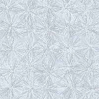

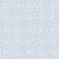
As far as I'm concerned the $ 50 US for the Gliftex Home download was a great investment. They have a free demo version available for download if you want to play around before you buy.
Sample Colors for Highlights
So now I had an image for the header and a repeating image for the background. I just needed to add some matching highlights for some other areas of my blog to tie the whole theme together. I decided to color the headings of my right and left sidebars to match one of the darker colors of the header image. But how to pick out colors from the image?
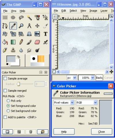
Gimp to the rescue again. I loaded my image again and selected Tools > Color Picker. You are then presented with an eye dropper pointer. I just clicked on interesting colors in my image to obtain a color value that I could type into my theme's style sheet for the background colors. In the picture below you can see the color value is "bec7d0" which you would write as #bec7d0 in the style sheet.
Results
While there are an many additional changes to my theme I could make I am pretty happy with the cool, blue-ish, wintry theme I've created:

Take a look at AgilityNerd to see it in action or, depending on when you read this, to see my next seasonal theme. I hope some of these tips might be helpful for helping you create your next theme.